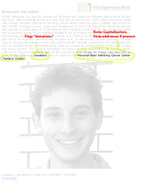
![]() POST-MORTEM POSITIVITY IS ABOUT VISUALIZING the good that people wish to do after their death. Using the dataset of the text taken from all the obituaries published in the United States for a given year, the system will search out the names of organizations that the decased will be leaving donations for either directly or as requested by families in memorial of the deceased. The 3d visualization will map the most popular charities to the age of the deceased on the Z axis, with the age (in discreet ranges) of the deceased on the X, and the number of deceased of a given age range giving to a particular charity on the Y axis.
POST-MORTEM POSITIVITY IS ABOUT VISUALIZING the good that people wish to do after their death. Using the dataset of the text taken from all the obituaries published in the United States for a given year, the system will search out the names of organizations that the decased will be leaving donations for either directly or as requested by families in memorial of the deceased. The 3d visualization will map the most popular charities to the age of the deceased on the Z axis, with the age (in discreet ranges) of the deceased on the X, and the number of deceased of a given age range giving to a particular charity on the Y axis.
SCALE:
population of USA: 298,444,215
death rate: 8.26/1,000 = 0.8%/year
annual deaths: ~2.4 Million deaths/year
annual deaths to nearest power of 10: 1,000,000
estimate number of deaths with obituaries (power of 10): 1%
number of organizations listed in two days of obits on legacy.com: 8/20 = 40%
number of organizations to nearest power of 10: 10%
estimate number of charities donated to (power of 10): 100
1,000,000 * .01 * .10 / 100 = 10 donations/charity/year
based on this estimate, I figure there would be enough data to visualize for a given year. If my calculations are high, I would add the ability to visualize data from more than one year at a time.
Visually, the 3d bar graphs will be gray on a green background to evoke gravestones, but with more lively and optimistic accent colours, like yellow (angelic) and baby blue (to symbolize new life).
NOTES ON DATA MINING:
SKETCH:
